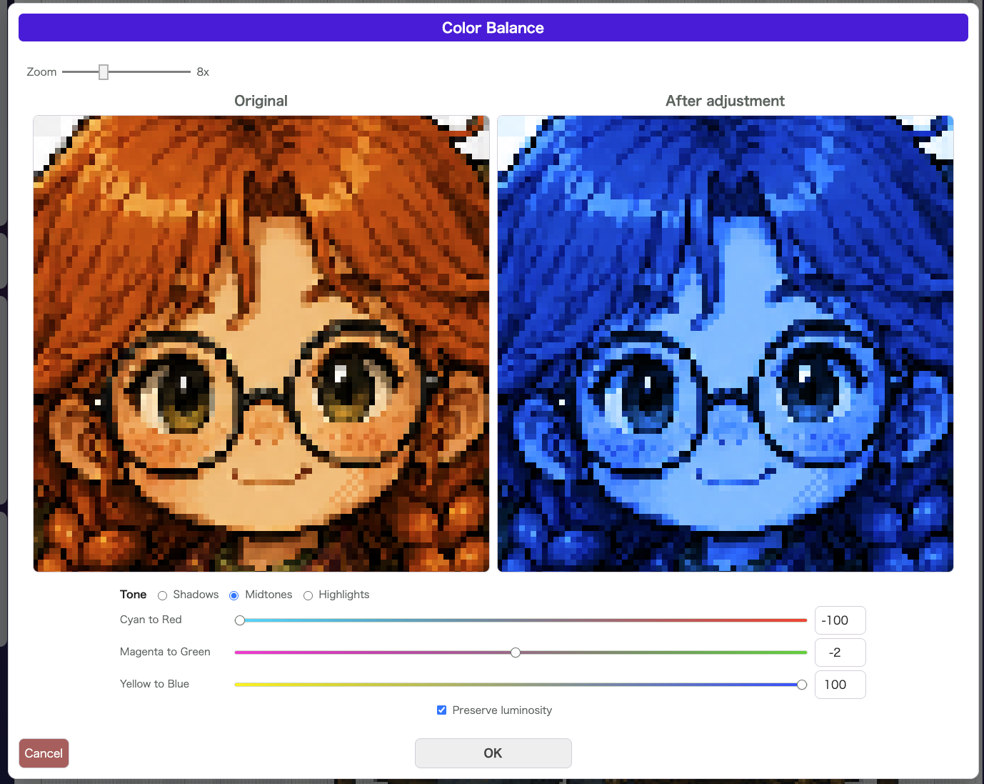
Color Balance does not shift the whole image in one flat step. Instead, it lets you adjust the color feel separately for Shadows, Midtones, and Highlights, which is useful when you want to refine the mood more carefully.
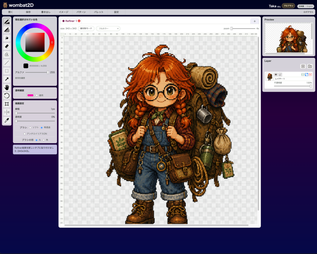
Make sure the image you want to adjust is open.
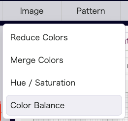
Open Image > Color Balance to compare the original and the adjusted preview while working with the Cyan–Red, Magenta–Green, and Yellow–Blue axes.
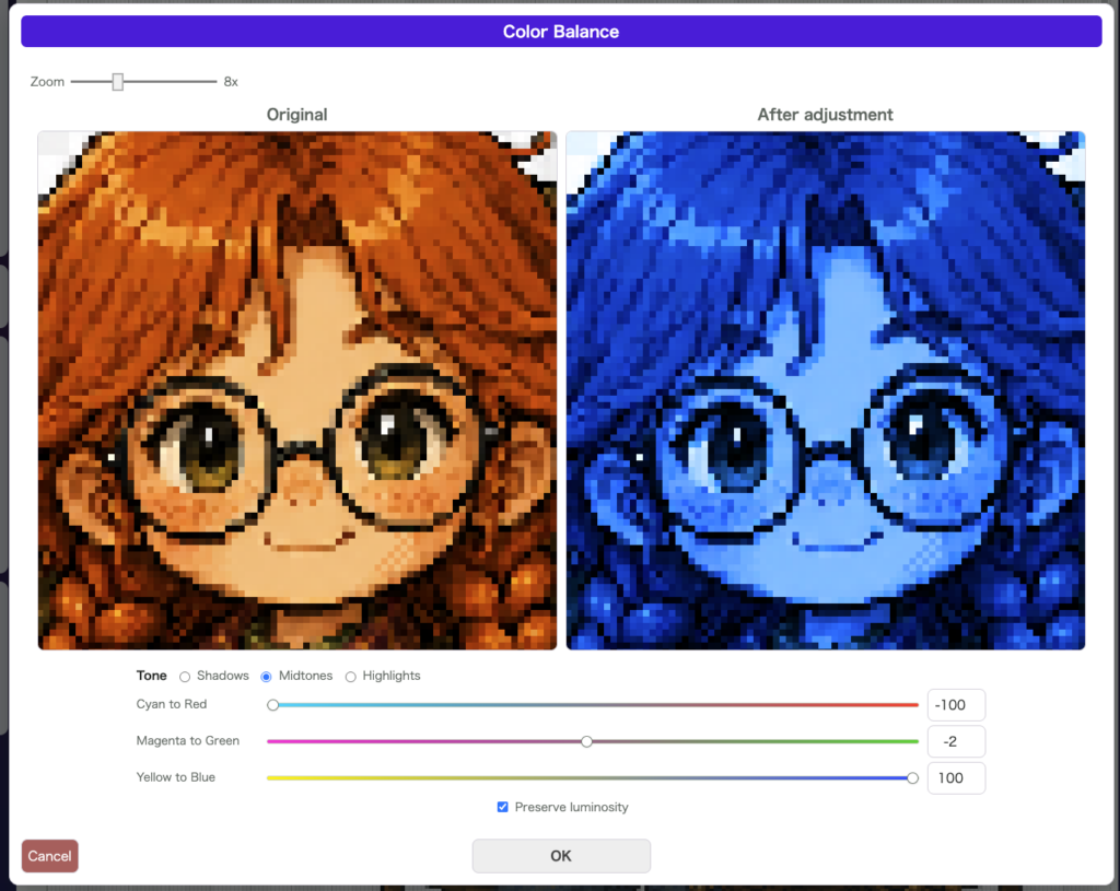
The Preserve Luminosity option helps you shift only the color feel without disturbing the brightness too much.
For example, you can make only the shadows cooler, warm only the midtones, or push only the highlights toward yellow to suggest sunset light. Compared with Hue / Saturation, it is more useful when you want to keep the texture and material feeling of the original drawing intact.
Good Use Cases
- You want only the shadow colors to feel cooler
- You want to change only the color of the light
- You want to tune the atmosphere of the image in a more granular way
Notes
- You can inspect the preview while zooming
- Each tonal-range adjustment is preserved independently
- You can undo it after applying it